It is currently 23rd October and I actually have the seeds of an idea germinating in my mind so I thought I better get this idea on paper so to speak and see where it goes.
I have felt for quite a long time that the complete digital templates that come with our kits are very much under-used and almost never altered so I thought that we could take a look at altering one of the templates and creating a new layout.
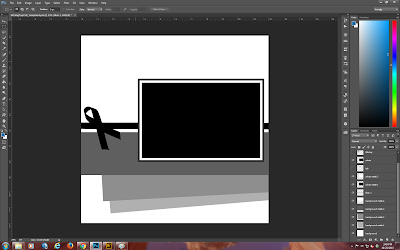
Open up one of the templates.
You will see that there are several paper elements, a ribbon, a tab, a frame and a couple of photo mats. You will also see that there are several layers in the layers palette at the right bottom of my screen.
At this point, I have removed the title tag and the tab at the top of the photo by clicking the eye to the left of those items in the layers palette to turn them off.
Here I decided to replace the rectangular photo matte with a brushed mask which I created for another project.
Now we are beginning to see a completely different flavor to the template. The structure remains the same but we are now entering the world of a more art journal style.
At this point, I thought that I would select my photo to use on the mask so opened up my circus photos.
None of those photos feel right for the layout even though they are all of the model circus at Ringling in Bradenton Florida, so I have closed up that whole folder and gone looking for something else that I think will work.
As an aside here, it was Ariauna's 17th birthday today. She has grown into such a tremendous young lady and I am sure that many of you will remember seeing lots of layouts of her through the years.
Anyway ... I have now found a photo I would like to use and added it and clipped it to the mask and turned off all the other part of the layout. The reason I have done this is to check that there are no harsh lines on the photo.
I am not sure if you can see it but there is a harsh line at the top of the photo which I am going to soften. To do this I selected a fairly grungy brush, adjusted the size and used it as an eraser on the photo and the mask.
Now is the time to turn on all the other elements in this layout.
The fun part is about to begin. I still don't care for the title block or the tab on this layout so they will be turned off. Also, you can see that the photo I selected is a vertical format - we will fix orientation later on.
Here I have opened up 4 papers which I think will work with the photo I chose. Clip the papers to the layer masks of the papers and then use the layer styles menu to make drop shadows to add some depth to each layer.
You will see that I have not used a background paper for layer matte 4. I like the way it looks with just a white fill.
Leaving the black and white photo mattes also works with this photo and I think the subjects do stand out well.
Now to finish off the layout. I selected one of the stamps that came with the kit and a fiber. Added both to their own separate layers and then used a gradient to color the stamp.
I do hope you like the finished layout.
Your next stop is:
http://


Great idea to change up the layout a bit in the templates. :)
ReplyDeleteThank you Julie. Had fun doing it.
DeleteWonderful result. I love seeing how all these steps are needed for a beautiful end result.
ReplyDeleteThanks Hetty.
DeleteGreat end product! Thanks for sharing the process.
ReplyDeleteThank you very much.
DeleteAwesome, great tutorial, love the way the picture pops!
ReplyDeleteThank you so much.
DeleteExcellent tutorial. Don't you just love photoshop. Wonderful!
ReplyDeleteThanks Josette and yes I love photoshop!!
DeleteNeat how sections of the photo fall "outside" the frame. Very artsy looking. Thanks for sharing the "how to" with us.
ReplyDeleteMany thanks Karen!
DeleteGreat layout!
ReplyDeleteThank you very much.
DeleteBeautiful layout Annette!
ReplyDeleteThanks Donna.
DeleteYour digital LOs are always amazing, Annette! Love it!
ReplyDeleteAlways great to see your "How To's" with such good results!
ReplyDeleteThank you Kay - always means a lot from you.
DeleteGreat Tut!!
ReplyDeleteThank you Carolyn.
DeleteGreat tut on how to change up a template Annette! The layout turned out nice.
ReplyDeleteBless you my dear.
DeleteYou are so right. These templates are under-used! Thanks for showing us how versatile these gems are!
ReplyDeleteThanks Lisa.
DeleteGorgeous! I don't do digital a lot, but thanks for the tutorials!!! Very helpful!
ReplyDeleteLilian
The Leaf Studio
Glad you like them and come on over to the dark side!
DeleteThanks for the tut and love the layout
ReplyDelete