Wednesday, December 28, 2016

CS Blog Hop Dec 2016 - Shades of Winter

I am in stressed out mode about my blog entry for this month.  It started as wanting to do an animated gif but that did not go so well - obviously I need a whole lot more practice playing with this concept - not something I have time for right now.  So this month I am doing a basic layout using the components from this totally delightful kit.

First off I opened all the components from Shades of Winter and created a blank 12" x 12" canvas at 300ppi as I always do.

Also opened up a wonderful photo of my friend Jayne with her fur baby - Archie!


I have brought into the layout part of one of the quad backgrounds and enlarged it to fit.  Now I want to make a gradient overlay using some of the colors from within the photo and once done, I will edit it to allow for opacity of not more than 40% so the original pattern of the background shows through.


Now I am adding a few of the really lovely elements from this kit.  Be right back.

Here is the finished product.

Enjoy.


I would also like to take this opportunity of wishing you all a wonderful, happy and healthy 2017.

Wednesday, November 30, 2016

CS Blog Hop November 2016 - Paradise

OK so it is 1st November and the new kit is here, downloaded, unzipped and installed and Photoshop CC and my Adobe Bridge are now open and I am looking at a blank canvas!


It took a while, but I have now opened up ALL the lusciousness from this wonderful Paradise kit.  I think CS has outdone itself with the vibrant color palette this month.  Just gorgeous.


All these super colors make me want to go off and do all the challenges for November in the forum.

What I have now done is build a template to use with a single photo.  I decided to use a single photo as my background here and this one seems to have a really nice tropical feel to it, which I think will work with the colors and elements in the kit and the photo that I have in mind.


Those of you who know me well are probably wondering what I am doing now.  Well after several minutes of playing, I have brought in my photo and played around with the shadows and added a few layers and this has now happened.


These water color style leaves and hibiscus flowers are amazingly awesome - Jac you have outdone yourself with these!!  Anyway,  I am now playing around with embellishing this photo and you will have to wait and see what I have come up with momentarily.

Here you are - the finished layout.


I hope you like this layout.  The colors are just drop dead gorgeous and the digital kit really does speak to me so you have all probably seen all kinds of stuff in the galleria from me.

Please enjoy the holiday season and stay safe.

Friday, November 25, 2016

CSBlog Hop - 2016 Garden Holiday or Christmas Thyme

No sooner than Karen puts out a call for interest in a blog hop for this cute Christmassy kit than I have to open everything in the kit up and see what I can do!!


Now open up a blank canvas on a transparent background.  In this case I am making a card so chose 7" wide x 4.5" high at 300ppi.

Looking at the printables, I really like the one on the bottom left and I think I will use a selection from that one as my background.  Of course, I will rotate what I choose by 90 degrees.


Once the selection is made, and pasted into the new file, duplicate the layer and rotate it by 180 degrees and then you can go ahead and play with the opacity.  In this case, I reduced the opacity by 50% of the second background layer.  Then I used an eraser brush to erase some of the center part of the merged background.  You can play around with flow and opacity at this stage also.


Here is what the top layer looks like after being erased.


You could save this as an overlay/semi vignette for use with later projects as well.  If you do that, make sure you label it with something that you can remember!!!


Above you can see that I am beginning to build a card with various of the components from within the kit.

Add a stamp greeting in a toning color.


Wishing everyone a wonderful Christmas.

OK it is now Election Day - 8th November and the invitation states that we need to make 3 cards or one layout or one project so what I will do is make a layout a bit later in the week when things have calmed down a bit here.

Today is 19th November and things have not calmed down since election day but I thought I better get the rest of my blog entry done prior to the lunacy of next week and 4000 calorie meals!!!

This one is a layout utilising some of the beautiful elements of this delightful kit.  I have a stock photo of the Petronas Towers in my stash that I have never used.  This is the layout that I created with the photo.  It seemed like a good way to use some of this kit.


Your next stop is  http://craftycolonel.blogspot.com/2...

Wednesday, October 26, 2016

CS Blog Hop October 2016 - Literature

Hello everyone

So the new kit, Literature arrived 12 days ago and in the meantime, we have had Hurricane Matthew!  The house got boarded up, supplies got stashed, bathtubs got filled, laundry (interminable) got done, basically it felt like we were preparing for war!  The hurricane came and went with a whimper luckily but it took us two full days to take the shutters off, tidy out and clean the garage so we had space to store the shutters and clean the house twice - once before the hurricane and once after.  I really have not had too much time to play around with the kit.

This is what we received.


I went ahead and opened up a new file 12" x 12" at 300ppi on a transparent background.  Then went off in search of a photo to use for a layout and I came up with a delightful picture of Luke and Leia.


I think the coloring of this photo will work very well with the Literature kit.  Also I think that I may use some of the new textures and overlays that came out recently.


Back to the kit.  I have selected the dark coral color from the quad print and filled the base layer with that color.  Created another layer and applied and cream colored gradient across the screen horizontally.  I have added one of the overlays and applied basic styles to the overlay to add a bit of depth.

Now for the photo.


I really feel that this photo needs to be blended into the background more and that the color of the background needs to be adjusted so I am going off to do both of those things.  Back in a while!  I just used a mask which I had in my stash.


Now for embellishments and text.

For text this stamp was crying out to be used.  So I made a brush out of it.


To use the brush, I make a new layer and have the brush on its own layer.  In actual fact, it is always a good idea to make a new layer for every element, word, embellishment that you use.  You can always rearrange layer order, hide layers, change layer styles or do pretty much anything in a non destructive manner.


When I made the brush preset it was at 738 I think.  When I wanted to use it I used the right facing square bracket on my keyboard to increase the size of the brush.  To decrease the size you can use the left facing square bracket.  These two keys will do the same thing for any brush.

OK now for embellishments.  I really like the semi opaque flowers that come with the kit so made a selection of that embellishment and of course made a new layer as well.


When I added the flowers, the stems hid Leia's face so all I did was change the layer order to hide the stems behind the mask.  Then made some more layers and pasted the flowers in various places and in various orientations multiple times.


I hope you can see but I have turned off the eyeball to the left of a few of the layers because I felt I had added too many flowers.  I will still turn a couple more off but I think you get the general idea.


Also added narrow stroke and nominal drop shadow to the text stamp.  I do like the scatter of these delightful flowers behind the masked puppy photo and hope you do too.

Happy hopping!

Tuesday, September 27, 2016

CS Blog Hop September 2016 Garden Shed

Well who could resist playing with such a delightful kit immediately.  Well not quite immediately for me as I got very busy and spent most of Thursday 1st September in the dentist chair.

Anyway, I downloaded and installed this fabulous kit and started off by making my own overlay.


To do this, I made a transparent blank background 12" x 12" at 300ppi.  Then cut and copied part of one of the 4 way prints and played with the opacity and flow.  Added a couple of the cute semi transparent images and then on the 4 way print layer erased a very large circle using a very fuzzy and very large brush and ended up with what you see above.

Then I opened up a new transparent background, 12" x 12" at 300ppi and dragged in this overlay.  Added a white fill layer beneath the overlay and now I am ready to start.


Create a new layer above the overlay and set the blend mode to overlay.  Select your brush and color and start painting.  I make my opacity around 11 or 12%.


I hope you can see this, but the shading around the plant and the butterflies has become much brighter.

Now we can start to build the page.


I have brought in a stamp, frame and mask from my stash and I will be playing around with all these momentarily.  First I have to find a good photo to use here.

Found the photo and have come up with this.


I hope you like what I have made here.

Wednesday, August 31, 2016

CS Blog Hop August 2016 Sunflowers

Hello everyone.

By now you must all know that the CS digital offering each month has changed somewhat dramatically but there is still lots and lots of goodness and versatility in the current offering.  What you actually get are the digital versions of the stamps, some of the embellishments, a 4 way  print and some other stuff but in my opinion the most important part of the kit is the color palette.  This month the Sunflowers kit does not disappoint in terms of color and I wish I had had more time to play.

Anyway, I am trying to decide what I would like to show you all this month with this luscious palette of colors and images.

One of the things that I should use much more often is the justify text tools in photoshop.  Most of the time CS comes up with wonderful stamps which are perfect for me to use in place of journalling (mainly because I am lazy) - Anyway I thought we could visit justified text this month.

As always open up a new blank document 12" x 12" at 300 ppi.


Now I always open up the Bridge and search for everything in the kit.


Time to go look for a photo or two to use. This time I am going to open up my temporary pictures folder which I keep on my desktop and select the folder called Copyright free images.

And here they are!


What I am going to do now is build a layout using one or two of these photos and the color palette and kit items from Sunflowers.  Back in a tick.

Found the picture I am going to use.


And here you can see all the Sunflowers goodies opened up with the photo.  I am sure you agree that the color palette of the kit will work really well with this photo.


The layout is made and I created a tag using one of the premade tags and filling it with matching background color.  Now to type some text and show you all how to manipulate it to justify.  Open up the sub-menu for type and paragraph and then click the paragraph tab and the lines symbol at the top right of the box.


That brings up a menu that has justification in that.  Click justification and the submenu will show on your screen as above.  Here is a quick explanation of what each of those controls does.

~ Word spacing the space between each word.
~ Letter spacing is the distance between letters.
~ Glyph scaling controls the width of the characters.
~ Leading controls the spaces between each line.

These are all things you can play around with to get your desired effect.  The settings you choose will depend on the font you decided to use.  Some of the more fussy fonts are much more difficult to deal with because the letters are all different point sizes.  This is not an easy thing to master.  It does become a lot easier if your journalling words and the space you are journalling in is are both of a reasonable size.  You can see from my box with text that my words just do not work for left and right justification using the font I have chosen.


To finish the layout I added the cute round cut out and placed a lens over the top of it.  I do hope you like my final layout.  Also I hope that you play around a bit with text justification for journalling.


See you all next time.

Tuesday, July 26, 2016

CS Blog Hop July 2016 - Office Space

With the advent of the digital kit membership changing in August, I thought I would play around a bit with making a digital swap page using the color palette from Office Space, together with some of my own art and some stamps which I have in my stash.  The reason I am doing this is to show an example of what can be done and also to show my fellow quick page swappers that there are a gazillion ideas out there and in our own imaginations.

The digital scrapbooking arena is totally infinite.  You are only limited by unfamiliarity of your software.

Anyway here goes.  As always open up a new file 12" x 12" at 300 ppi set on transparent.  I also went ahead and opened all the papers and elements of Office Space in Bridge.


Here you can see that there are some absolutely stunning colors and patterns in the backgrounds and overlays.

Go ahead and open up some of the backgrounds so that you have your color palette to choose from.


Now you can start to "paint" your background using brushes together with layers and layer styles.  The world is now your oyster and you can get very very creative with using brushes and layer styles.

All I have done so far is select two of the background colors and a couple of brushes from my stash and painted with the brushes on two separate layers.


Here you can see I have added a bunch of layers with an assortment of different brushes.  As yet I have not added any layer styles, patterns or textures.


Having got several layers painted, I have now started adding textures and styles.


As you can see, my created background is beginning to look like a canvas that has been painted.  There are thousands of styles that you can add into your photoshop program which can be found on the internet and you can also create your own.

Further addition of styles and layers as well as an overlay yield this.


At this point, I have gone ahead and merged down all the layers apart from the overlay and the transparent base layer so that I can go ahead and create a hole for a photo.


I also rotated the overlay - just because and duplicated the overlay layer just in case.  You can see here that I have selected the rectangular marquee tool and made a selection on the canvas layer beneath the overlay.  Go ahead and cut your selection and you should have a great hole in which to place your photo.  Voila!!!


Now we can add some layer styles and shadows etc. to the layer with hole in it.  In this case I have just given it a fairly dramatic drop shadow.


Now that I am looking at it, I really do not like the opacity of the overlay so I went ahead and reduced the opacity a bit.


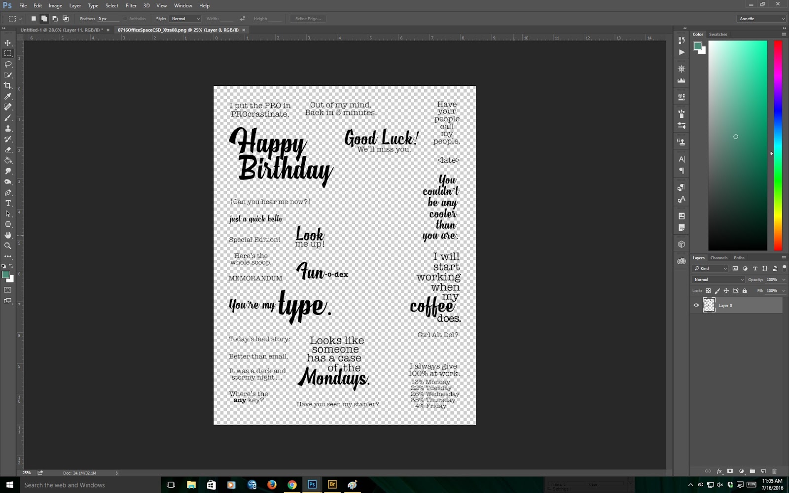
The time has come to add a stamp or two.  In this case, I just want to use one stamp so I opened up the word art sheet that comes with the kit.


Before I choose which stamp(s) to use, I also want to find a photo which I can put in the hole I made.  Be right back ....

still looking .....

OK I have the photo, but before I put the photo in, I have selected the stamp and placed it on the layout.


Of course you can go ahead and give the stamp some styles etc., but in this case I just wanted a little subtlety and stamped at a medium opacity in the green from the background in the kit.

Now for the final layout with photo!


I hope you like my layout and will visit my blog again.

Meantime, for those of you who play in the digital page swap hosted by Cathy Gray, I do hope that I have given you some food for thought here and that this terrific swap continues and will get some new players too.

Happy scrapbooking everyone.