By now you all know that I became a granny on 28th January to a very cute little girl called Elliot Alicia. You have also probably seen a whole bunch of pages appear in our facebook arena. Needless to say she is cute as a button but I am not sure that baby photos will work with the brand new Steamworks kit.
You have also problably seen that I have made some layouts and cards already with this awesome kit but right now I am drawing a blank as to what I should show you all how to do here. So I will come back when I have an idea.
Well here we are a week later and I still do not have a clear idea of what I want to do so I went ahead and opened up all the kit elements from Steamworks hoping that inspiration will strike!

Above you can see all the Steamworks goodies together with some other backgrounds which I thought may work well with the kit.
Now on to find some inspiration.
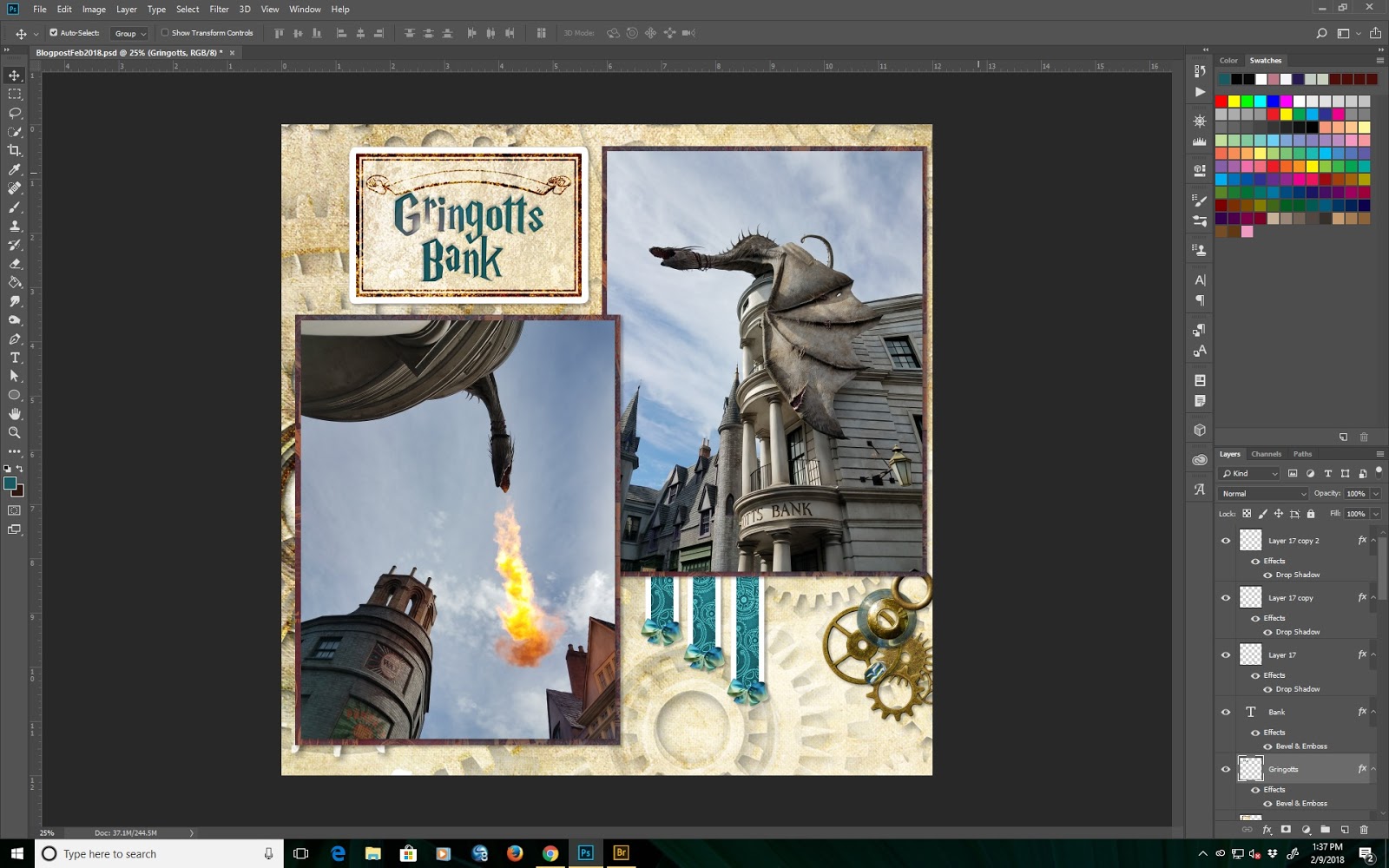
As you know, we recently went to Universal Orlando to hang out with Ariauna and her boyfriend who were visiting from Australia. While at Universal, we went to Hogwarts and of course, this kit is absolutely perfect for Hogwarts photos. Here are two of the fire breathing dragon on top of Gringotts Bank.

These photos are both rather blue so I think they will contrast well with the muted tones of the kit. Here you can see I have brought in a background and created photo mats from the quadprint.

Hopefully embellishing this base will not be too hard. One of the things I have noticed and would love if Club Scrap brought back to the digital kits is fibers and dimensional elements. Of course, since I own EVERYTHING that Club Scrap has released in digital form, I do have lots of these elements and recoloring is pretty straight forward.
Anyway, now to go look at what I can do with the rest of the pieces of the kit. You can see that I am now beginning to build the page. I have added a resized journalling box and 3 strips from the cutapart sheets.

Text is now added in a Harry Potter style free font.

Notice here that there are no layer styles, shadows or anything else on this page. A lot of the time when I am making digital pages, I do not know how I want the page to look when it is finished so I usually add all those additional details when I have finished constructing the entire page or spread.
As mentioned above, I really feel that fibers would be a welcome addition to the digi hybrid kit so I have decided to stray a bit from Steamworks and see if I can find some fibers that I can add to this layout. Back in a sec.
OK. Here you can see a trial of 3 different bows. These are from Connections, Lock and Key and Serenity. Of course I can still recolor everything.

All three of these bows work from a color standpoint, but I think that the one I like best is the one from Serenity so I am going with that one. All I did was the make sure that I resized the bow and do two duplicate layers.

You can see the page is shaping up quite nicely now. On to doing something with styles and shadows. Shadows add dimension to the page. Most of the time, I use drop shadows which are extremely versatile and have limitless possibilities. I think that this layout does need some drop shadows so I will add some now.
In this screen, you can see the drop shadow I have selected. this one is rather small with a low opacity. I really do not want to overpower any of the elements or photos in this layout.

Continuing to add drop shadows to all the other elements I arrive at this.

Note that I have not yet done anything with the title inside the box at the top left or the blank space at the lower right.
I have to say thank you to Lisa Dolezal who used some of the elements from Full Circle for one of the challenges this month. I copied her idea and made the little cluster on the bottom right.

Now all that remains in the text in the top left. Both words are on separate layers but the font size is the same. I think a bevel and emboss should work here. I have also decided to add a small lens flare to the word Gringotts.
And now the layout is complete. Thank you for reading my blog this month. I hope you have enjoyed it.