Wednesday, April 24, 2019
Tuesday, May 1, 2018
CS Blog Hop April 2018 Shibori
So it is not quite April but ... Kay's spoiler has appeared on the blog and who can resist playing around with those colors!!!
This month I have decided to use a template which came from Jana Oliviera.

I think that the colors from the kit will make a great layout based around this template. I personally love playing around with brushes and Jana has made a really nice layout here using brushes. There is of course, no guarantee that this will remain the way it currently looks but bear with me while I start playing around.
Also open on my computer right now is Kay's spoiler blog post so that I can make color selections directly from it.

To make use of the template, I think that using clipping masks and additional layers will work well. The background for this is going to stay white for the time being.
Select your first color using the eyedropper tool and then make a new layer and fill using the selected color with the paint bucket tool then go to layers>create clipping mask>enter and you get something that looks like this.

It is amazing how just one step can change the whole feel of something isn't it?
Continue doing the same procedure until you have built the background using selected colors from within the Shibori kit.
OK - moving on, I have got to this point. Some things have moved, some have disappeared and a photo has been added.

I do like the slight curvature to the right side of the photo and I like the drop shadow for this as well but now I think I want to put a small and very light vignette on the photo. Below you can see I have added a light shadow style vignette.

The vignette ended up being a bit heavy so I erased parts of it and also made a new title using a free font from Dafont called Moyko.

Now all I have to do is wait until Monday to finish this layout and blog post.
Oh Joy! The kit is here!!!
Installing it now and I do so hope that there are lots of things for me to use to finish this layout!
Here you can see that I am beginning to build the layout with embellishments from the Shibori kit.

Still building the layout, I am now using a slightly recolored flower from the Blues which came out in May of 2015.

Also used above is the texture stamp as a brush to add a little more color to the background.
I just decided to move the title and this one is finished and so is my blog entry. I do hope you like what I have made here and if you have any questions, please feel free to contact me.
Here is the finished layout.

Enjoy the hop!
Monday, April 9, 2018
Acrylic Pouring
Hello everyone
You have probably noticed that there are lost of posts about Acrylic Pouring popping into your news feeds on facebook. There are in my feed too so I thought that I would have a go at this totally addictive if expensive and wasteful art form.
First off you need to gather some supplies.


OK there is no exact science to measuring ingredients and everyone who I have spoken with mixes their paints very approximately.
You also need a bunch of plastic cups and it is absolutely essential that you cover whatever workspace you use because you get all kinds of overspill from the pouring. I have used some construction style brown paper because we have loads of it in the house.
As many of you know, I have made a series of 6 panels using the colors above and the method I used is called a dirty pour.
What you do is add some white glue, Floetrol, and paint to some cups and mix up the color really really well. Once you have mixed all your colors in separate cups, add a couple of drops of 100% silicone and stir each cup.
Then take another cup and "layer" your paints in the cup you will pour from. When I did this each color remained fairly separated. Once you have all your paint in your pouring cup you are ready do do your "dirty pour".
The way I did this was to put some plastic handled push pins in the back side of the frame of 6 canvasses so that they were raised above my work surface. Once all were in position, I was ready to start playing.

Here is a quick shot of a couple of the cups ready to be mixed.

As I said above, there is no exact way of doing this.
When I did my pour, I poured all the paint in three swipes across all 6 panels. Once that was done, I picked up each panel and "moved" the paint by sloping the panels in each direction until the entire canvas was covered and I got some paint running down the sides of each panel as well. Once that was done for all 6 panels, I stood back and looked. I had absolutely no idea what these panels would eventually look like but while they were still wet they were totally awesome.
On a slight side note here, you need to do your pour in a relatively still air atmosphere. That prevents dust sticking to the pour.
Below you can see all 6 panels with their overspill. It took about 4 days for them the dry completely. I then sprayed them several times with clear lacquer and they are ready to be hung.
They are actually going into the guest room/nursery as a grouping and I am now waiting on Mr. Wonderful to work his magic and hang them for me.

Mr. Wonderful has now hung up these 6 panels in our guest room/nursery. This room has a bluish grey wall paint and dark grey curtains in it.

Since I wrote most of this I have tracked down a recipe. This one says:
5 parts Floetrol
3 parts Paint
1 part water
I have not tried this recipe (yet). Also I have to point out that I used Dina Wakley heavy body acrylic paint. Most other people have used regular liquid acrylic paint which I have not yet tried.
If you decide to try this asbsolutely wonderful technique, please post with details.
Thank you for looking.
Wednesday, March 14, 2018
CS Blog Hop March 2018 Daffodils
Oh Joy! This kit is truly to die for drop dead gorgeous. As I mentioned at the beginning of the month, I got photos that were perfect for this kit almost immediately. You have probably all seen the many photos of my new granddaughter Elliot on a multitude of different papers already but ... what a photo worthy subject she is.
We are very fortunate to have such a great baby grand and even more fortunate in that we get to see her almost every day for baby huggies!
Anyway enough rambling. I am here to write a blog post for the hop.
As always, open up a blank transparent background 12" x 12" at 300 ppi.

I use the full Photoshop CC and you can see how easy it is to make a new page.
Then open up everything from in the Daffodils kit. To do this I go to my Bridge>documents and type 0318 in the search box and hit Enter.

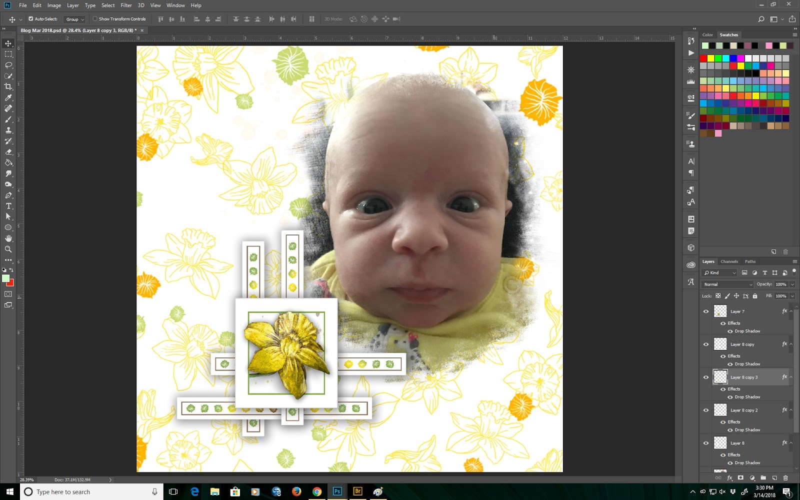
Here I have opened a new document and pulled in a photo of Elliot. This baby is so photogenic it is hard to choose photos to use but this one shows her being a little startled - hence the big eyes!

This photo has such hard edges that I really want to use a mask to soften all the sides.
In Adobe Bridge, I have opened up my folder that has all my masks in it.

From here on it is realtively straight forward. I need to find a mask that will soften the right side of this photo quite a lot and also the top and left side as well. The bottom I can deal with using eraser brushes.
I think this one will work but I may need to resize. Anyway, drag the mask and position it on top of the photo. Once there, go to Edit>transform>scale and a binding box with handles will appear for you to change the size of the mask. If you want to keep the proportions the same, use the shift key when you drag out on the handles. Once you are happy, hit the enter key or check mark. That sets the mask. Then move the mask behind the photo and select the photo layer and go to layer>create clipping mask and voila!

I am not sure if you can see this but at the top of the photo there is a distinct straight line. I do not want anything with straight lines on this layout so I am going to use a very soft fuzzy brush to remove the straight line part of the mask and photo. When that is done, you may want to merge your layers so you can resize without losing the correct aspect ratio of the photo. Below, you will see that I have already resized the mask with the photo and brought in one of the cut-aparts.

Now it is time to bring in a background or two or four! Here you can see that I am looking at the quadprint from the kit. Trying to decide what I would like to do is hard.

Of course anything is possible here. I do really like that bottom left print, the really light one so I selected part of that and brought it onto its own layer and resized. Now I do not like this cut-apart but I also brought in another embellishment.

Total change of direction.
What happened here is that I used one of the square cut-aparts and added a layer to it and brought in one of the cut out daffodil blooms so that the complete flower is visible above the green frame.

I like this a whole lot better and now feel that I am able to complete the layout.

This is now coming together!! I have added some more embellishments to the layout and now all I need is some word art!

Above is the completed layout. It is really very simple. The most difficult part of digital scrapbooking in my opinion is knowing how to do things.
Anyone is welcome to contact me directly and ask questions but I do have to point out that I use the latest version of Adobe CC and am not too familiar with Photoshop Elements and am not at all familiar with any other non-Adobe product but of course will help where I can.
I do hope you all like my layout and of course my grand daughter too.
We are very fortunate to have such a great baby grand and even more fortunate in that we get to see her almost every day for baby huggies!
Anyway enough rambling. I am here to write a blog post for the hop.
As always, open up a blank transparent background 12" x 12" at 300 ppi.

I use the full Photoshop CC and you can see how easy it is to make a new page.
Then open up everything from in the Daffodils kit. To do this I go to my Bridge>documents and type 0318 in the search box and hit Enter.

Here I have opened a new document and pulled in a photo of Elliot. This baby is so photogenic it is hard to choose photos to use but this one shows her being a little startled - hence the big eyes!

This photo has such hard edges that I really want to use a mask to soften all the sides.
In Adobe Bridge, I have opened up my folder that has all my masks in it.

From here on it is realtively straight forward. I need to find a mask that will soften the right side of this photo quite a lot and also the top and left side as well. The bottom I can deal with using eraser brushes.
I think this one will work but I may need to resize. Anyway, drag the mask and position it on top of the photo. Once there, go to Edit>transform>scale and a binding box with handles will appear for you to change the size of the mask. If you want to keep the proportions the same, use the shift key when you drag out on the handles. Once you are happy, hit the enter key or check mark. That sets the mask. Then move the mask behind the photo and select the photo layer and go to layer>create clipping mask and voila!

I am not sure if you can see this but at the top of the photo there is a distinct straight line. I do not want anything with straight lines on this layout so I am going to use a very soft fuzzy brush to remove the straight line part of the mask and photo. When that is done, you may want to merge your layers so you can resize without losing the correct aspect ratio of the photo. Below, you will see that I have already resized the mask with the photo and brought in one of the cut-aparts.

Now it is time to bring in a background or two or four! Here you can see that I am looking at the quadprint from the kit. Trying to decide what I would like to do is hard.

Of course anything is possible here. I do really like that bottom left print, the really light one so I selected part of that and brought it onto its own layer and resized. Now I do not like this cut-apart but I also brought in another embellishment.

Total change of direction.
What happened here is that I used one of the square cut-aparts and added a layer to it and brought in one of the cut out daffodil blooms so that the complete flower is visible above the green frame.

I like this a whole lot better and now feel that I am able to complete the layout.
This is now coming together!! I have added some more embellishments to the layout and now all I need is some word art!

Above is the completed layout. It is really very simple. The most difficult part of digital scrapbooking in my opinion is knowing how to do things.
Anyone is welcome to contact me directly and ask questions but I do have to point out that I use the latest version of Adobe CC and am not too familiar with Photoshop Elements and am not at all familiar with any other non-Adobe product but of course will help where I can.
I do hope you all like my layout and of course my grand daughter too.
Friday, February 9, 2018
CS Blog Hop February 2018 Steamworks
Hello all
By now you all know that I became a granny on 28th January to a very cute little girl called Elliot Alicia. You have also probably seen a whole bunch of pages appear in our facebook arena. Needless to say she is cute as a button but I am not sure that baby photos will work with the brand new Steamworks kit.
You have also problably seen that I have made some layouts and cards already with this awesome kit but right now I am drawing a blank as to what I should show you all how to do here. So I will come back when I have an idea.
Well here we are a week later and I still do not have a clear idea of what I want to do so I went ahead and opened up all the kit elements from Steamworks hoping that inspiration will strike!

Above you can see all the Steamworks goodies together with some other backgrounds which I thought may work well with the kit.
Now on to find some inspiration.
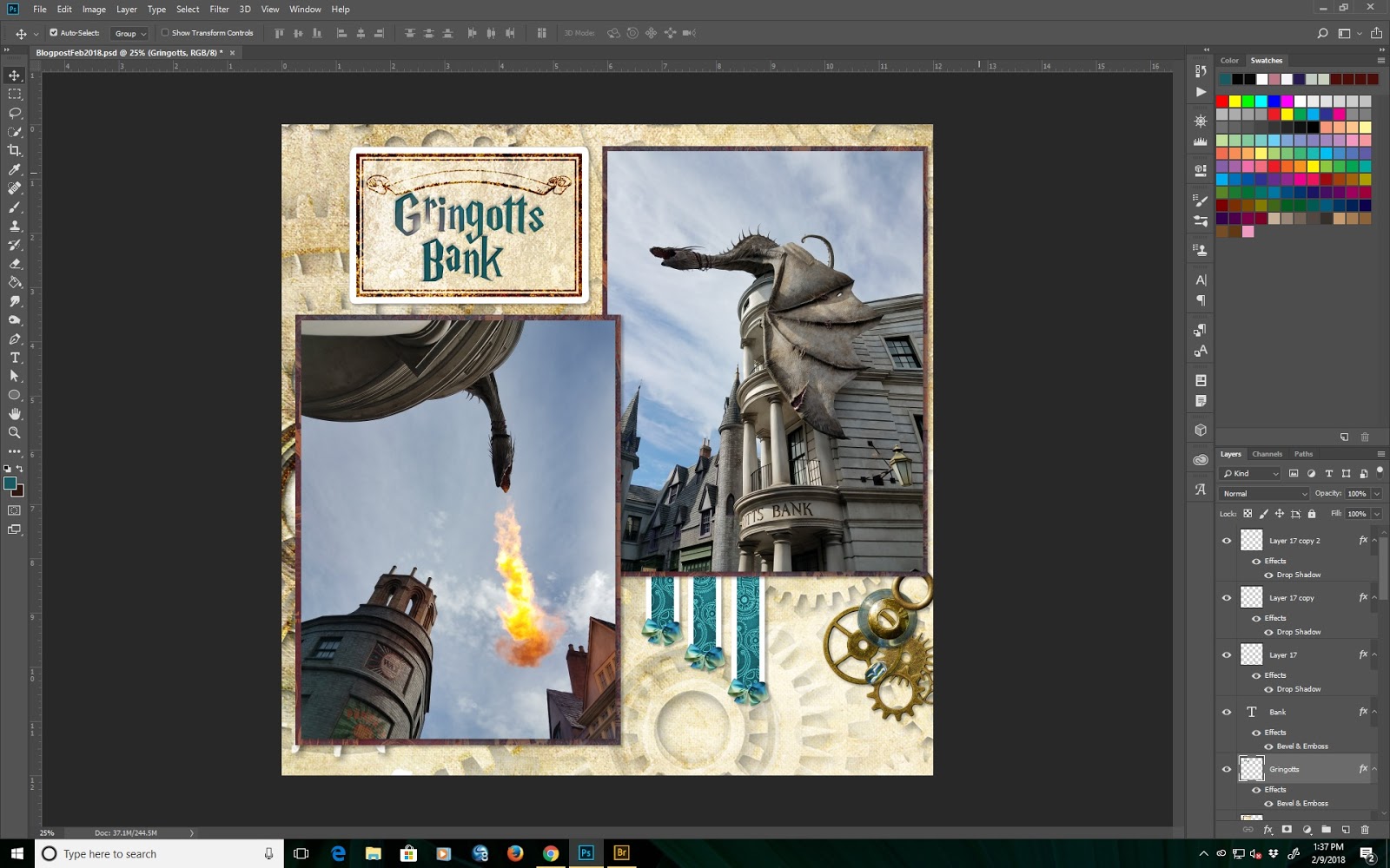
As you know, we recently went to Universal Orlando to hang out with Ariauna and her boyfriend who were visiting from Australia. While at Universal, we went to Hogwarts and of course, this kit is absolutely perfect for Hogwarts photos. Here are two of the fire breathing dragon on top of Gringotts Bank.

These photos are both rather blue so I think they will contrast well with the muted tones of the kit. Here you can see I have brought in a background and created photo mats from the quadprint.

Hopefully embellishing this base will not be too hard. One of the things I have noticed and would love if Club Scrap brought back to the digital kits is fibers and dimensional elements. Of course, since I own EVERYTHING that Club Scrap has released in digital form, I do have lots of these elements and recoloring is pretty straight forward.
Anyway, now to go look at what I can do with the rest of the pieces of the kit. You can see that I am now beginning to build the page. I have added a resized journalling box and 3 strips from the cutapart sheets.

Text is now added in a Harry Potter style free font.

Notice here that there are no layer styles, shadows or anything else on this page. A lot of the time when I am making digital pages, I do not know how I want the page to look when it is finished so I usually add all those additional details when I have finished constructing the entire page or spread.
As mentioned above, I really feel that fibers would be a welcome addition to the digi hybrid kit so I have decided to stray a bit from Steamworks and see if I can find some fibers that I can add to this layout. Back in a sec.
OK. Here you can see a trial of 3 different bows. These are from Connections, Lock and Key and Serenity. Of course I can still recolor everything.

All three of these bows work from a color standpoint, but I think that the one I like best is the one from Serenity so I am going with that one. All I did was the make sure that I resized the bow and do two duplicate layers.

You can see the page is shaping up quite nicely now. On to doing something with styles and shadows. Shadows add dimension to the page. Most of the time, I use drop shadows which are extremely versatile and have limitless possibilities. I think that this layout does need some drop shadows so I will add some now.
In this screen, you can see the drop shadow I have selected. this one is rather small with a low opacity. I really do not want to overpower any of the elements or photos in this layout.

Continuing to add drop shadows to all the other elements I arrive at this.

Note that I have not yet done anything with the title inside the box at the top left or the blank space at the lower right.
I have to say thank you to Lisa Dolezal who used some of the elements from Full Circle for one of the challenges this month. I copied her idea and made the little cluster on the bottom right.

Now all that remains in the text in the top left. Both words are on separate layers but the font size is the same. I think a bevel and emboss should work here. I have also decided to add a small lens flare to the word Gringotts.

And now the layout is complete. Thank you for reading my blog this month. I hope you have enjoyed it.
By now you all know that I became a granny on 28th January to a very cute little girl called Elliot Alicia. You have also probably seen a whole bunch of pages appear in our facebook arena. Needless to say she is cute as a button but I am not sure that baby photos will work with the brand new Steamworks kit.
You have also problably seen that I have made some layouts and cards already with this awesome kit but right now I am drawing a blank as to what I should show you all how to do here. So I will come back when I have an idea.
Well here we are a week later and I still do not have a clear idea of what I want to do so I went ahead and opened up all the kit elements from Steamworks hoping that inspiration will strike!

Above you can see all the Steamworks goodies together with some other backgrounds which I thought may work well with the kit.
Now on to find some inspiration.
As you know, we recently went to Universal Orlando to hang out with Ariauna and her boyfriend who were visiting from Australia. While at Universal, we went to Hogwarts and of course, this kit is absolutely perfect for Hogwarts photos. Here are two of the fire breathing dragon on top of Gringotts Bank.

These photos are both rather blue so I think they will contrast well with the muted tones of the kit. Here you can see I have brought in a background and created photo mats from the quadprint.

Hopefully embellishing this base will not be too hard. One of the things I have noticed and would love if Club Scrap brought back to the digital kits is fibers and dimensional elements. Of course, since I own EVERYTHING that Club Scrap has released in digital form, I do have lots of these elements and recoloring is pretty straight forward.
Anyway, now to go look at what I can do with the rest of the pieces of the kit. You can see that I am now beginning to build the page. I have added a resized journalling box and 3 strips from the cutapart sheets.

Text is now added in a Harry Potter style free font.

Notice here that there are no layer styles, shadows or anything else on this page. A lot of the time when I am making digital pages, I do not know how I want the page to look when it is finished so I usually add all those additional details when I have finished constructing the entire page or spread.
As mentioned above, I really feel that fibers would be a welcome addition to the digi hybrid kit so I have decided to stray a bit from Steamworks and see if I can find some fibers that I can add to this layout. Back in a sec.
OK. Here you can see a trial of 3 different bows. These are from Connections, Lock and Key and Serenity. Of course I can still recolor everything.

All three of these bows work from a color standpoint, but I think that the one I like best is the one from Serenity so I am going with that one. All I did was the make sure that I resized the bow and do two duplicate layers.

You can see the page is shaping up quite nicely now. On to doing something with styles and shadows. Shadows add dimension to the page. Most of the time, I use drop shadows which are extremely versatile and have limitless possibilities. I think that this layout does need some drop shadows so I will add some now.
In this screen, you can see the drop shadow I have selected. this one is rather small with a low opacity. I really do not want to overpower any of the elements or photos in this layout.

Continuing to add drop shadows to all the other elements I arrive at this.

Note that I have not yet done anything with the title inside the box at the top left or the blank space at the lower right.
I have to say thank you to Lisa Dolezal who used some of the elements from Full Circle for one of the challenges this month. I copied her idea and made the little cluster on the bottom right.

Now all that remains in the text in the top left. Both words are on separate layers but the font size is the same. I think a bevel and emboss should work here. I have also decided to add a small lens flare to the word Gringotts.
And now the layout is complete. Thank you for reading my blog this month. I hope you have enjoyed it.
Wednesday, January 31, 2018
CS Blog Hop January 2018 - Surprise
And surprise it was when I got my download email on January 1st!!!
Happy New Year everyone.
I got up on New Years Day hoping that my download email would be in my inbox and there it was. Of course, I downloaded, unzipped and installed and when I opened everything up, I was blown away by the vibrancy of this wonderful new kit. Of course, it was even more vibrant than Kay's "surprise" spoiler and even more so since I have spent a lot of time playing with A Night at the Met! More on that kit later on.
Anyway, after playing around with Surprise and doing all of the current challenges except the project use it one for January, I decided to write my blog post. So here we are on 4th January and it is freezing in south Florida so I am bundled up in my art cave writing my post.
First of all I was looking at the stamp images that come in the digital kit and decided to open up this sheet and take a close look.

There on the right center there is a stamp with 3 parcels. That is the stamp I am going to play around with.
Here it is on its own transparent background.

You may be wondering what I am going to do with it - let me show you. Many of you know that Taryn Cornelius has given permission for me to use some of the wedding photos from her daughter Shay's wedding last October in the New York Botanical Gardens. In fact, you have probably seen a bunch of layouts appearing in the forum and on Facebook. This is going to be another.
I have selected a photo and layered it above the stamp.

What happens now is a bit of magic within photoshop. Go to Layers>createclippingmask>enter. This is what you see!

Now for some tidying up before creating a full layout. You can see that the photo has partially obliterated the left and right parcels of the stamp and also the bow at the top of the center parcel. I am going to remove the parts of the photo that are superfluous by using the edit>cut function after selecting those parts to be removed. The hardest part of the photo to remove is the bow so I used the lasso tool to select that part of the photo.

Now the stamp is beginning to evolve into a usable component for a layout. Here you can see that I have created a balloon on a string and added a copied ribbon bow to the top of the center gift! Not sure if I am happy with that but ... we shall see.

Ok - this has now evolved. I did not like the bow on top of the center gift so created some balloons on strings instead.

Now I think I can proceed. I opened up the quad print and selected colors for the balloons from within the quad print. To make the balloons those colors I created 3 further layers and used the paint bucket tool to flood each of those layers and made clipping masks as shown above. This is where we are at. At this point, I think it is necessary to add some layer styles to give this some dimension. Also it is time to create a new 12" x 12" on transparent background at 300ppi document and start building the final layout.
So I spent a quite a while playing around with building this layout. I got rid of the left and right side gifts completely. Added a bunch of additional different sized balloons and added a recolored background and word stamp and ended up with this as the final layout.

I do hope you like what I have done here. Please enjoy the entire blog hop and again Happy New Year.
Friday, January 26, 2018
Making Quad Prints
Hello all
Adeline Brill has requested a quick tutorial on how to make quadprints from your digi stash.
Here you are.
First off open up a new blank document 8.5" x 11" at 300 ppi on a transparent background.

Then open up the backgrounds that you want to use.
In this case I have chosen backgrounds from Artifacts and Celebrate.
Here I am starting with a background for Celebrate.

All you need to do now is select a piece of it 4.5" x 5.5" go to the edit menu and select copy, then go to your blank document, use the edit menu and select paste and voila!

Do this for the remaining backgrounds and you will have a quad print. Of course you will need to move the backgrounds into their respective places. Note that I have put each selection on its own layer just in case I want to change something later on. You can save this if you wish and print directly on 8.5" x 11" stock.

If you have a large format printer you can do the same by selecting pieces of backgrounds that are 6" square and arranging them in a similar fashion.
I hope this tutorial helps.
Subscribe to:
Posts (Atom)