Tuesday, August 25, 2015

Club Scrap Blog Hop August 2015 - Woven Strands

So the digi kit got here on 1st August.  It got downloaded, unzipped and installed and ... I started a thread in the forum almost immediately.  In my haste to get a layout up, I did not name the thread correctly.  Apologies.

The good news is that there are lots of layouts and cards already in the thread.

As always I am slightly stumped as to what to do for you all this month but I know that I will find something.  After all it is only the 3rd of August today!!!

Now it is 6th August and I have an idea which I hope you will all like.  What I am going to do is the technique challenge for August.

First off, open a new blank canvas 12" x 12" and transparent background.


Now open up a whole bunch of background papers which will be used for color selection.


What we are going to do is "paint" a new background using the colors in the background papers as our palette.  You will need to open up your brush palette now.


I have made a start here using two of the background papers with a round fuzzy brush and just dotted the transparent background randomly.


Continue doing this while at the same time varying the brush size until you have the background completely covered.

I am accelerating the process here a bit and have added a layer filled with just white.


To do the shaving foam technique digitally, go to filter>pixellate>mezzotint>medium lines and you get this:


Now to to filter>blur>radial blur and set the slider to 100, blur method to zoom and quality to best and apply this as many times as you like until you are happy with the result.

Here I have applied this filter twice and really like the soft result.


Duplicate the layer and remain on the original layer and go to filter>distort>twirl and set the angle value to what pleases you in the new dialog box.  You will see a sketch of the twirl angle in the bottom right of the new dialog box that appears.


Go to the new layer and do the exact opposite of what you just did on your original layer.


Alter the new layers blend mode to lighten, merge the layers and voila!


Now you can go ahead the build a layout or card or other project.

Here is the finished layout.


I hope you have enjoyed my creative journey.

Here is another that I did using one of the Qddl pages that came with the kit this month.


Your next stop is:

http://cathyjgray.typepad.com/the_artful_gamut/2015/08/woven-threads-blog-hop.html


Tuesday, July 28, 2015

Club Scrap Blog Hop July 2015 - Cantina

Well it is that time of the month again.  I am starting my blog entry a tad early this month because I have had my thinking cap on ever since I saw the spoiler for the July kit.  You all know that I absolutely love bright colors and Cantina promises to be a sure winner.

Anyway, while I am pondering the new kit (which will be here in a couple of days), I thought I would let you all know how grateful I am for all the love that you leave me each month.  It means such a lot to me and encourages me to continue with my monthly blog for Club Scrap.

Here goes for July.  Here is something that I came across a while back but could not decide what photo to use for it.  Now that Cantina is here I have chosen a photo that I think will be much enhanced by the lovely colors and textures of this wonderful kit.

Here is the photo.


As always, open up a blank new document with a transparent background.  I have already selected a background and placed my photo on it.


You will see that I have roughened up the photo at the bottom.

Now add another layer and type some text. I have chosen Forte regular from my font library and resized my text to make it really pop.

An aside here - fonts are rather temperamental and can cause crashes.  They also take up a lot of space.  What I do fairly regularly is clear out the fonts that I just do not use.  By doing that, my font library becomes a whole lot more manageable.  Also I keep all my downloaded font zip files on an external hard drive so I can always find the font again if I need to.

Going back to the layout, I thought it would be fun to do something a little different.  My version of photoshop has a solid 3D component so I thought we could do 3D for the big title.


When you hit yes a whole lot of magical stuff happens!


Here you can see that I have been playing around with textures and gradients.  I think that enough has been done with this title now.

Enough fun!  I added one of the beautiful overlays and now I really think that this is done.


I do hope that you have enjoyed my creative exploration.  Please bookmark my blog so you have it as a reference.

Meantime, your next stop is:


Monday, June 22, 2015

Club Scrap Blog Hop - June 2015 - National Parks

This month I thought I would do something completely different.  I know that many of us are into art journalling and that so many of the books that we make lend themselves to this totally freeing art form, so we are going to make a digital art journal page here.  

Of course page size does not matter so whatever canvas size you are comfortable with works for art journalling.  Most people like to use bigger pages but for this blog I decided to make a slightly smaller page.

As always, open a new blank page on a transparent background.


I chose 8" wide x 10" high.

Now open up a bunch of papers, elements, stamps etc.  and start on your creative journey to build your page.  Art journalling has no recipe, it is all to do with how you feel.


Now it is time to make a start on building my art journalling page.  At this point I have absolutely not idea what direction this will take.

So now I have a background in place and have overlayed it with a CS Texture from 2010.  You can find Volume 1 in the digital store.


Here you can see that I have started building up my background using various papers, textures and layer styles.  You can really get some super depth by playing around with the various styles and filters that come with photoshop.


Now you can see the page building up.  Also I will be rotating it to landscape soon.


I decided to rotate clockwise.


Continue to build until you are happy with what you have.  Here is my final page.  Most of what I used came from the National Parks kit and I also used some elements from my stash.


I do hope that you have enjoyed my little creative journey.

Your next stop on the hop is:


Tuesday, May 5, 2015

Club Scrap Blog Hop May 2015 - The Blues

First I would like to thank everyone who has taken the time to leave me a bit of love.  Your comments mean  the world to me.

Now I would like to get into my post for this month.  Many of you have probably seen a lot of layouts from me in our gallery.  That's because I really like this kit.

Anyway this month I thought I would do a variation on a time-honored process.  Years and years ago we used to have sepia photos in our albums.  What I am going to show you is how to do a digital cyanotype.  


I found this photo in my stash.  In this case, I chose a photo that is black and white but if you choose a color photo you can very easily convert it to black and white.

To make the photo a cyanotype, go to Image>Adjustments>hue and saturation and hit enter.


At this point you will see a new dialog box at the top of which is a drop down box saying preset: default.  Click on the down facing arrow and select cyanotype.  Hit OK.


Now you have a cyanotype photo to work with.  Here you can see I have already put my cyanotype photo


onto the layout I am going to build.  Now you can go ahead and select papers and elements and other things that you are going to use to build your layout.  In this case, I want to use a mask beneath the photo.

Here I have selected a mask from my stash and placed it over the photo.


Now it is placed where I want and resized.  Move the mask to below the photo and select the photo.  Go to the layer menu and select create clipping mask and hit enter.  You now have your masked cyanotype.


I always do a merge down here so that the photo does not become detached from the mask if I want to change the order of layers in the stack.  Here I have selected and placed the background I want to use and resized the photo so that it fits across the width of the paper.


I have added a bow and a sprig of leaves and have selected a stamp to use.  I have made the stamp into a brush by selecting it and going to the edit menu and going to define brush preset.


And now for the final layout.


I do hope you have enjoyed this tutorial and my final layout.

Your next stop is:


Wednesday, April 29, 2015

Club Scrap Blog Hop April 2015 Botanicals

Well here we are again and what an absolutely lovely kit for the month of April.  The colors are so appropriate for April - what with the beginning of spring and Easter and Mother's day coming up.  As soon as I saw the first spoiler for this kit I absolutely knew what I was going to do for my blog post.

Of course in the middle of preparing my notes I did the Shatterproof challenge and made some layouts using this wonderful Botanicals kit.  Here is just one.


The rest of them have been posted in my gallery in the Club Scrap Forum and on Facebook.

Anyway, enough of that - here is what we are doing this month.  I figured that this topic had not really be visited in the past.

Negative Space!

or 

White Space!

What both refer to are areas on your layout which do not have anything in them.  It does not have to be white but what is important is the arrangement of your photos/elements/text etc. 

As a design factor, negative space is used to add symmetry to your layout to make it look clean and natural.  Negative or White space should be used to align or balance elemental objects to make them look more pleasing.

Here is an example.


Generally speaking the design factor is not really important to me when I digi or paper scrap.  I tend to go with what feels good probably looks good and of course, with digi scrapping you can always delete!

So now we are going to construct a layout using the Botanicals kit.  I am off to find a photo now.

Here it is!


Open a new blank 12" x 12" document with a transparent backgound at 300 ppi.

You could use the rule of thirds for making negative space layouts and get really technical about it but I tend to go with my gut and put the focal photo somewhere off center and build from there.  You will see in the next photo that I have decided to use a mask for this photo.


I felt at this point that I would build a quick template to use here.  So here is what I have so far.


It is already coming together quite well.  Now I have added the photo and a couple of additional elements to the template.


Now the time has come to experiment with background paper to see what will work with this.  After much trial and error I found that the lovely pink worked well so here it is with the paper added!


Now for a little embellishment and a few words.

And here is the final layout.


I do hope you like what I have done with negative space and will play around with this on your own.  

Your next stop on the hop is:

Tuesday, March 24, 2015

Club Scrap Blog Hop March 2015 - 50s Kitchen

It's that time of the month again but before we get started I wanted to thank all of you for the comments and love you have left me.  It really does mean a lot to me.

Anyway, today I thought we could take a look Making a Silhouette!

There are lots of different ways to make silhouettes but I think this method is probably the easiest. First you have to select a suitable photograph and desaturate it.  When selecting the photograph, find one that has some contrast but not too much fine detail.  Here is the photo I have chosen prior to doing the desaturation.


You will see that this image is "almost" a silhouette already!  Also to do the desaturisation go to Image>adjustments>desaturise.  Hit enter and you get this!


At this point I applied a levels adjustment layer to give a tad more contrast.


Concentrate on the silhouette shape you want to keep and do not worry about the background.  The background stuff can be erased later.  You just have to make sure that you have a fairly clean outline to select.

You can see that the girl is actually sitting on a rocky precipice and I am going to select the girl with the rocky outcropping.  Use the quick selection tool to select the silhouette.


Here you can see that I have made the selection.


Duplicate the selection once you have the marching ants by using controlJ.


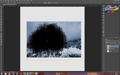
Here you can see that I have 4 layers.  The original photo turned off.  A copy of the original photo desaturated.  The photo with an applied levels mask on it and the selected silhouette portion.  Now you can tidy up around your selection.  You can see that I have some "hairy" bits in various places and I am going ahead to tidy those up.  To do this you can use a variety of ways.  I have chosen to a hard edge brush as an eraser.

Now you have to fill the silhouette with black.  To do this press D so the foreground color is default black, fill the shape and then copy the black shape to a new transparent background and save it as a png on a transparent background.


You are now ready to start playing!

Here is what I came up with. 


I do hope you enjoy my blog post this month.

Your next stop is: http://debduzscrappin.blogspot.com/2015/03/50s-kitchen-blog-hop.html