Tuesday, September 23, 2014

Club Scrap Blog Hop - September 2014 - Blueprints

It's that time of the month again, and we have a wonderful September kit to play with.  What I thought I would do is throw it out to you and ask what would you like to see in the way of tutorials?  Everyone has different styles and different ideas about what they want to do and of course everyone is at different levels in their digital scrapbooking.  So please give me feedback as to what you would like and I will see what I can do.

Meantime, let's get cracking with this months project. First I made a new document and I always make mine 12" x 12" at 300 ppi on transparent backgound.  Then I opened a photo - this one of the Lilypads by Frank Lloyd Wright at the Johnson labs in Racine, WI.  I thought that this photo would be wonderful layered with some of the Blueprints papers and elements.


I then went into Bridge and opened up the file with all the papers and overlays.

If you look at the photo and the bridge folder you can see that there are loads of papers and overlays which are going to work well with this photo.  Here you can see that I have opened several papers and overlays. Now we can begin to build the layout.

I have added a background and double mat so far but not made any layer styles to this yet.


Now I have added the overlay and this is where the fun begins.


With the overlay layer selected open up the filter gallery.

You will see all kinds of filters that you can play around with.  For my layout I have selected the color pencil filter and brought up the submenu behind it.

Change the filter to notepaper, with Image balance of 25, graininess at 10 and relief at 11 and hit OK.  This will add a very soft texture to the overlay.  I also changed this layer to hard mix and you can see a bit more texture in the overlay.

Now for embellishments.  Back to the bridge and find the folder with the embellishments.  I knew that I wanted to use this cluster for this layout so went ahead and opened it up.

Position the cluster over the photo and at this point I erased a small amount of the paint spatter where it was on the photo.

At this point I decided to take a look at the stamps that come with this kit.

I selected a stamp and made it into a brush.  Added a new layer on top of all the others and brushed the stamp on.  I added a white stroke, bevel and emboss and default drop shadow to the layer and voila!

I hope you have enjoyed the process today and will try doing this for yourself.  Your next stop is 


Tuesday, August 26, 2014

Club Scrap Blog Hop August 2014 Cinema

Having had every intention of doing my blog hop entry early in the month, here I am the day before writing it.

It always seems as if there is plenty of time but then the time just slips away.  What I am doing is my final entry for Weekly Chronicles this month called Cocktails and Dreams.  I think the Cinema kit lends itself well to what I have in mind so here goes.

Open up a blank canvas in photoshop.  I always do this 12" x 12" at 300ppi.


Now I open up the photos I want to use.  These pictures are from the dinner cruise Mr. Wonderful and I took last Friday.  


Now I open up my Adobe Bridge and find the file with the background papers in it.


Here you can see that I have added my photos and photomats to my background.


Now for the fun stuff.  Back to the Adobe Bridge and this time the extra folder for Cinema.

Here are some of the extras - I want to use the curly bracket twice in my layout so will select it with the rectangle tool and do a copy/paste onto the layout.  Here you can see that I have the curly bracket on my layout but now I need to change its position in the layers palette and change its size to my liking.


I added an embellishment and some text and we are done.


I do hope you like my layout and leave me a comment.

Next is 


Tuesday, July 29, 2014

Oopsie Daisy - Club Scrap Blog Hop July 2014

So I got and downloaded this phenomenal kit on 1st July and at the moment I have all the paper kit stuff sitting in my shopping cart at the Club Scrap store. Should I? Anyway this kit is terrific. I have done such a lot with it already, most of which you will have seen in the PSL Spinners Galleria. I love this kit and daisies are such a happy flower (You've got mail!). The colors within the kit lend themselves to all kinds of photos. Let me see what we can do here. Started writing this on 1st July and now it is 22nd July. I drew a huge blank for 3 weeks but now I have an idea.

First open a photo in photoshop.  For this small tutorial who could resist a photo of Piers?


Make a duplicate of the photo and close out the original for safekeeping.  At this point I usually make an extra duplicate layer just in case.

Change the photo to black and white via your favorite method.  I use image>mode>black and white.  A dialog box comes up where you can adjust each color to your own specifications.  In this case I just used the default settings you see here.


Now go to the filter gallery and choose Filter>distort>diffuse glow.


Here is the selection you have just made.


You can see a lot of difference between this and your original.  When the setting dialog box comes up for diffuse glow I used 5 for graininess, 7 for glow and 20 for clear amount.  You can play around with the sliders to see what pleases you the most.  

Then at the very bottom right corner there are two symbols.  One is a trash can and the other is what looks like a dogeared piece of paper.  Click the dogeared paper button and you will get a duplicate diffuse glow layer.


Next look in the sketch folder for the graphic pen filter.  Again a dialog box will come up to enable you to play around with the settings.  I used 12 for stroke length, 64 for light/dark balance and left diagonal for stroke direction.

Here is the finished black and white "sketch" which I had in mind.


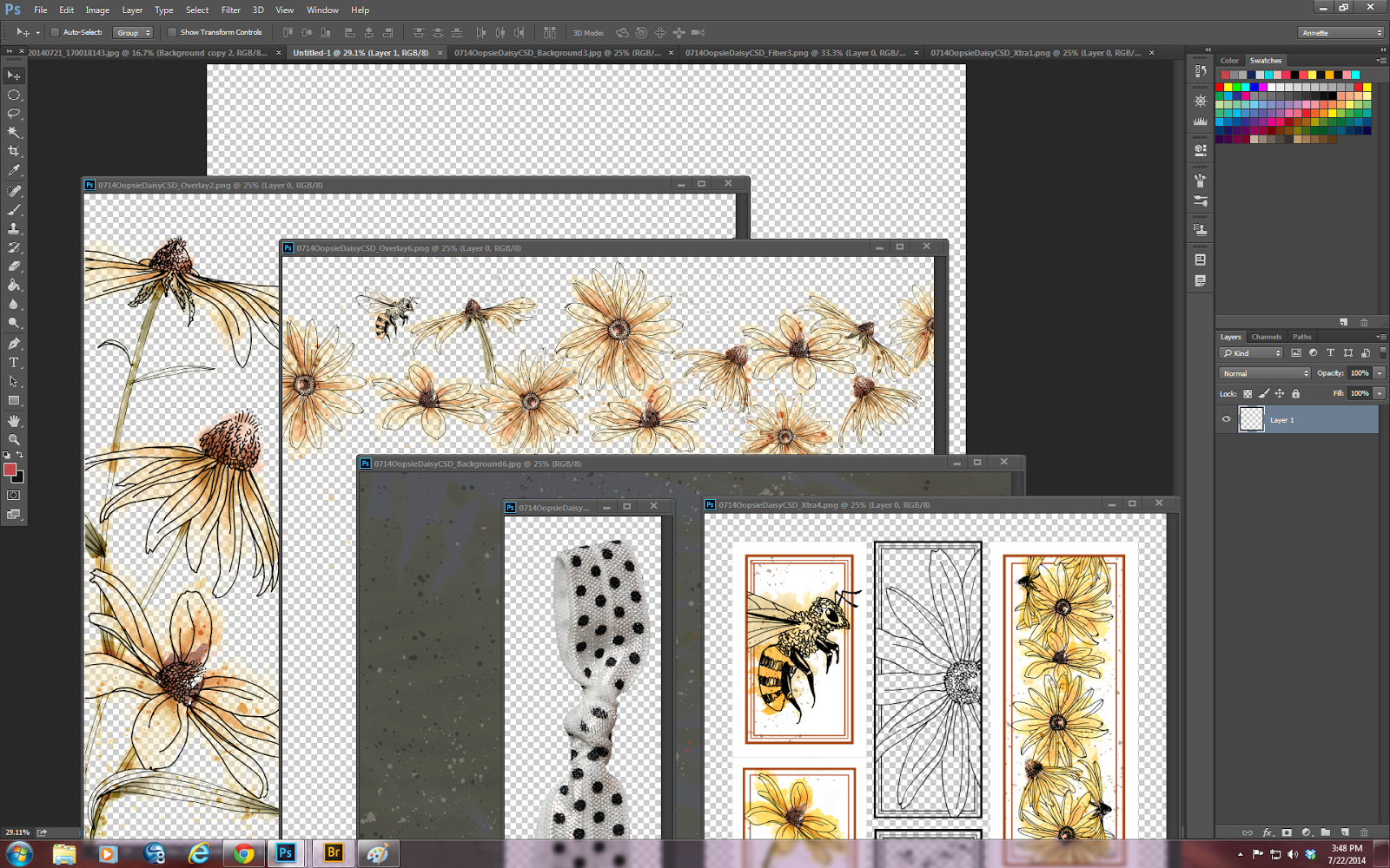
Now for the fun part using Oopsie Daisy.  Create a new blank Canvas.  I always make mine 12" x 12" at a resolution of 300 ppi and transparent background.  Then go ahead and select some of the wonderful papers and elements from Oopsie Daisy and open them all up.


It is at this point that I wish I either had a huge monitor or two of the one that I have now.  More real estate would really help here.

Anyway I have something in mind so the next pictures are the evolution of a layout.


I have inverted the darkest background, increased the size of my sketch of Piers and applied an overlay so far.  Having applied a second overlay I decided that I did not like the big bee so simply erased him.


Now I have added some fibers in order to make this layout fit the challenge for PSL this week which is fibers.


Now I have to add some words so that the layout meets all the criteria.  For the words I will take a look at the stamps that come with this delightful kit.


Of course I will find something to use from this sheet and convert it into a brush.  Then when I have done that, I will add a black layer to my layout and apply the stamp choosing the color from the palette of yellows and oranges already on the layout.

And voila!!!


And just as a memory jogger here is the original photo.


I do so hope you have enjoyed my tutorial today and am happy to send you on to 


Sunday, June 29, 2014

Win a camera

<div style="clear:both"><a href="http://snapknot.com"><img src="http://snapknot.com/blog/wp-content/uploads/2014/06/cameraday_quote.jpg" title="SnapKnot" alt="SnapKnot" border="0" /></a></div><div>Courtesy of: <a href="http://snapknot.com">SnapKnot</a></div>

Tuesday, June 24, 2014

Club Scrap Blog Hop - June 2014 - Picnic

So I guess we should visit with something that I use a lot in Photoshop.  Blend Modes.  Using blend modes gives us many options for creativity.  Blend modes change how two layers interact with one another.  Results depend on many factors which can make using blend modes somewhat unpredictable.

Let's get started.

First open up some papers, overlays and photos.  For this tutorial I am using papers and overlays from Picnic.


In my version of photoshop which is cc the blend mode is located at the top of the layers panel and to get all the different modes just click the down facing arrow!


You will see that the blend modes are grouped into sections.

I do hope that the following example will tempt you all into playing around a bit with blend modes and how they can be an effective tool for digital scrapbooking.

Taking a look at the Darken blend mode - If the pixels of the selected layer are darker than the ones on the layers below, they are kept in the image.


Above you can see that the photo is "overlaid" onto the striped paper.

If the pixels in the layer are lighter, they are replaced with the tones on the layers below.


OK so here is what I am working with.  I do notice that there is a line across the photo which I just don't like and the pavement needs some work to blend in with the background paper.


At this point I am going to play around with the eraser using a soft fuzzy brush and varying opacities and flows to make this blend better.

Here you can see that I have removed that harsh line and blended better with the background.


At this point you can continue and complete the layout.  I have used some of the elements from this fabulous kit from Club Scrap (if you have not yet got yours you need to go to http://www.clubscrapdigital.com/ and buy yours now.


And now for the final addition.  A stamp from the unmounted sheet.  I love the windows on this background paper.


I do hope you all like my small tutorial on blend modes.  Such a fun tool in the repetoire.

Your next stop on the blog hop is:


Monday, May 19, 2014

Club Scrap Blog Hop May 2014 - Dungarees

Hello everyone

I finally got to download, unzip and install this very versatile collection today (8th May) - Yes I am very far behind but I really wanted to make sure I got my blog post of May done in a timely manner.  Reason is it always takes me forever to come up with a good idea.

Anyway here goes.  I think that one of the most underrated tools in photoshop is the stroke tool.

First off find and image and open it up in photoshop.  Since we are working with the Dungarees kit I chose an image which I felt would be complimented by the color palette in this kit.  This one is the base of Ayres Rock in Australia.


I will assume that you have an image open with the Background layer only.  Since we are going to create two layers for the final effect and we need transparency requirement is to have regular layer.  The reason is that the Canvas Size dialog will expand the canvas to transparency when the image does not have a background layer.  Click once on the padlock icon in the background layer in photoshop cc or double click it in earlier versions to unlock the layer.

The next step is to go the Image>Canvas size.  A new dialog box will appear:

Check the relative option in this box and type in the same number for width and height.


In the above shot you can see a border around the photo.  I selected 40 pixes for width and height.  You will now need to create a new layer beneath the layer you are using.  The way I do this is to just click the new layer icon at the bottom of the layers palette and drag it below the photo layer.


Fill your blank layer with white using the paint bucket tool with the color selection (eye dropper) tool.


What you should now have is a photo on top of a layer with a white fill.  Now go to Layer>layer style>stroke


You will see that I have set the stroke size to 2 and the position to inside.  Color should be set to black.

Once you have those settings click OK.

Now you are going to expand the canvas size again.  Go to Image>canvas size and I am using 160 pixels for width and height.  Hit OK.

You should have something that looks like this:


Add another layer at the bottom of the composition.  Fill your new bottom layer with white and you can now add your stroke effect to the bottom layer as well.


Hit OK .  Then all you need to do is merge visible layers and you will end up with a very elegant double bordered photo which you can use in a layout.

Here is my finished layout!!!


I hope you all enjoy the rest of the blog hop.  Your next stop is:

http://craftycolonel.blogspot.com/


Tuesday, April 29, 2014

Club Scrap Blog Hop April 2014 - Hydrangeas

So it is that time of the month again!  I have to say that I am not totally enamoured of the Hydrangeas kit but here is a little something that I made.


Starting off with a template - this one from Bookshelves.  I absolutely love this template and you can see it has several layers.

Bring in the background paper and the photo!  The photo here is the latest one of Ariauna enjoying Simba.  I have done a little filtering on the photo so you can see the whole of Ariauna's face.  You will see that I have added the photo above the photo mask.  Now I have to resize.


Resizing is easy peasy.  Click on the object to be resized and go to edit>transform>scale.  Once there you will find that your photo or object has some "handles".  To resize keeping the same aspect ratio, grab one of the corner handles and hit the shift key at the same time.  Then just drag.  Once you have the desired size let go of the handle and the shift key.  Then all you need to do is go to Layer>create clipping mask and you have your photo attached to the mask.


Here I decided that I did not like the border element in the template so I just turned it off by clicking the eyeball of that layer.


Also you can see that I have added a paper from Hydrangea.

Now I am collecting goodies.  I just love this embellishment cluster that came with the kit and I also love the wording on it.


Now I do not like the wax seal part of the template or the tag so I am just going to turn those off too.

Now for a little magic.  I have some tremendous brushes which I do not think I use enough so I loaded a couple in and used them as erasers to make a little edge contrast on the background paper.


And here is the final layout.  Enjoy.