This month I was somewhat taken aback by the beautiful artwork that was created for the Dahlia kit. Normally I do not go for water color type flowers but this kit is really lovely particularly because of the colors used.
That being said, I am not entirely sure that I am going to use this extremely vibrant color palette. Today is 6th April and I have been thinking about this month's NBUS challenge a lot. Pam is asking us to use a stamp or stencil that makes us think of rain.
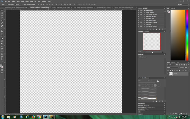
Open up a new blank 12" x 12" canvas at 300ppi on a transparent background.
I actually have several photos which I shot in Venice while it was raining so thought to use one or two of them for this challenge.
Open up your background and in this case I have recolored the chosen one to a more green hue to almost mimic a rainy and stormy feel.
Of course you can tweak it to your hearts content using the eyedropper tool. This is what I ended up with.
I think it has a good and stormy feel to it but now I want to blend the photo into the background to make it look like the whole background is watery. To do this I use a combination of masking and erasing using textured brushes. The result is
At this point, I have opened up everything Dahlia in my Adobe Bridge.
As you can see the layout is taking shape now. I have added a recolored embellishment and a music score stamp and script stamp as well.
Now I want to make the whole page look like it is raining!
To do that, I have to find a stamp that says "rain" to me. I am going to use a stamp from Aurora Borealis which I think will work. Off to experiment a bit!
What I ended up doing was making a brush out of the stamp using edit>define brush preset and then making the brush extremely big. At this point I dropped the opacity to something that looked like grey rain to me and then swiped this brush a couple of times on separate layers above the photo but below the embellishment. I then added a soft drop shadow and emboss.
I hope you can see the rain like grey brush work above.
Now all I have to do is add a title and I thought I would use some of the water drops from Castaway and complete the layout.
Here is the final layout. I hope you all enjoy my rainy day in Venice and I also hope that this meets the challenge criteria for NBUS this month. I posted the layout when I completed it to give you all a small taste of making use of stamps in a slightly different way.


