Wednesday, January 27, 2016

CS Blog Hop January 2016 - Celebrate

Happy 2016 everyone.  I know that lots of you got art making goodies for Christmas and are probably enjoying the latest and greatest of everything artsy and scrapbook/stamp.  I for one was really looking forward to getting the Celebrate kit this month and as soon as I saw the kit, I knew that I wanted to do something a bit different for my entry to the blog hop.

Here goes.  I was out walking a while back and came across this delicious plumeria tree which grows in my neighborhood.  Of course, apart from enjoying its wonderful perfume I had to take a photo or two of it.  Here is one of them.


What we are going to do is turn this into an aged monochrome image.  As yet I have no idea what tint I am going to use but will be experimenting for a while to see what works.  Of course, I will give you some step by step instructions but right now it is time to play a bit.  The first step is to create a duplicate layer of the photo so you do not alter the original in any way.  Go to layer>duplicate layer>OK.


Turn off the eyeball in the background layer to hide it.  Next you are going to turn the photo into a black and white image.  There are lots of ways of doing this but the way I do this is go to image>adjustments>blackandwhite>


Once you have done that you end up with a screen that looks like this.


I use PhotoshopCC 2015.  You can see there are all kinds of sliders to play around with.  You will see that the filter is set to default.  If you click the downfacing arrow in the default box, a number of different filters will come up.


These different filters are well worth playing around with until you find one that you like.  For this photo I selected the lighter tab and ended up with a fairly contrasty and well defined black and white photo.


Now open up the bridge with all the components from our gorgeous Celebrate kit (digital version):


I have decided to make this a greyish brown sepia style photo and the brown background from the kit is absolutely the perfect color.  Open the brown background and use the eyedropper tool to select color.  What we are going to do is make a color overlay using this color.


Go to Layer>Layerstyle>coloroverlay>


To make the overlay transparent double click the layer style eyeball in the layers palette.


Here you can see that the opacity is set to 100%.  You can either type in your percentage opacity or use the slider.  In this case I think opacity should be set somewhere between 45% and 55%.  The result is a somewhat softer but still very visible sepia style photo.


Now it is time to build our layout.  As always, make a new file 12" x 12" at 300 ppi.


I have decided to distress the edges of this photo a bit so opened up my bridge and did a search using the word "inked".  What came up was the wonderful pack of Inked Edges that Club Scrap made for us some years ago.


I went ahead and selected one of them and made a new layer on top of the photo.  Also cropped the photo quite dramatically.


Once you have your distressing sorted out you can go ahead and build your layout.

I have started to do this and here is an in between screenshot.


Here is the final layout.


I very much hope you have enjoyed the process here.  This soft style layout is very much outside my comfort zone but I think the photo lends itself well to being converted into a sepia style which is why I felt a soft style would make the photo pop a little.


Tuesday, December 29, 2015

CS Blog Hop December 2015 - Navigation

It's that time of the month again.  This month I am doing something extremely special for someone extremely special.

This is by way of a major shout out to Karen who is totally tireless in her administration of the Club Scrap Blog and the monthly Blog Hop.  So Karen, stand up and take a bow!

I came across this photo on facebook a day or two ago and thought what an absolutely adorable photo and what can I do to bring it back to life?


After a couple of hours of playing around with this, I came up with this version.  Karen I really hope you like what I did.


Now I opened up everything that came with Navigation in my Bridge.


I hope you can see from the colors in the thumbnails that this kit lends itself really well to my restored version of the photo.  So I immediately opened up a new file 12" x 12" on a transparent background at 300 ppi. I also pulled in the restored photo.


I have added some bokeh style scatters and placed the restored photo on top of the scatters.  Now I am going back to the bridge to select the papers I want to use.


Tinker around time to see what looks best.  Back in a minute with what I ended up with!


I think you can also see that I have made each layer have a style and created a frame effect with the photo using strokes.  At this point, I went ahead and pulled in a bow and one of the cut-aparts to use on this layout.


I am going to go ahead and change the color of the cut-apart a bit so that it matches up a bit better with the rest of the layout.  Also I moved the bow so it looks like it attaches the cut-apart to the layout.


I really don't think this layout needs anything else except to resize the bow.


Hopefully our very own and wonderful Karen does not mind what I have done here and also does not mind that I have posted this without her permission.  I will of course email Karen with a hi-resolution version of the layout and the restored version of the photo that originally came off Facebook.

I also wanted to take this opportunity of wishing each and every one of you a wonderful, healthy and happy 2016.

Your next stop is:

http://capecodscrapper.blogspot.com/2015/12/club-scrap-navigation-blog-hop.html

Friday, December 18, 2015

Club Scrap Blog Hop for 2015 Watercolor Christmas

Hello all

Just wanted to thank all of you who left me some love in November.  Your comments are all much appreciated.

Now on to this wonderful special release kit.  As soon as I saw the paper version of this kit I got online in the forum to ask for it in digital form and lo and behold a few days later it appeared!  Thank you to CS for yet again hearing our requests.

I was wondering if there would be a blog hop for this magnificent special kit and I did see that our very own Julie not only put a note in the forum for sign ups but also on Facebook so needless to say I signed up to participate in both places.

So lets make a start.

As always open up a blank canvas 12" x 12" with transparent background at 300 ppi.


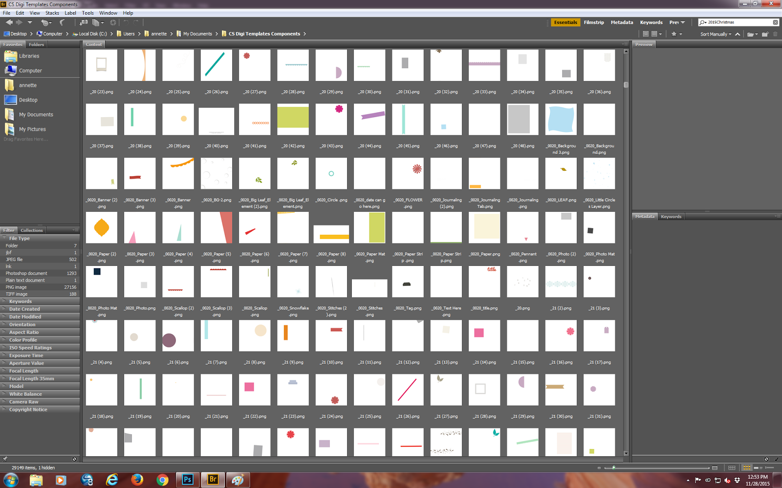
With such a glorious kit, I though I would fiddle around a bit with a more art journal style of page with a view to printing and framing or having made into a canvas wrap by the pro-lab I use.  To that end, I opened up my Adobe Bridge and found a file called Digital Template Components and opened that up.  Below is just a tiny part of this particular folder.


This particular folder has thousands of shapes which I can use to make up templates.  I have gone ahead and opened a bunch of different ones to see what kind of inspiration comes.


You can probably see that I have opened up all different kinds of shapes and included some text also.

Now go back to the bridge and open up watercolor christmas.


Even though I actually save my papers in one folder, and my extras in another and so on, by just typing in 2015Christmas into the search box in my bridge I can pull the whole kit together from there.

OK - now you can see that I have pulled in a whole bunch of layers and components, masks and other shapes to make a fairly artsy template to use with the backgrounds and goodies from this totally gorgeous kit.  You can see that I have already gotten carried away in my layout.  I had meant to take several more snapshots so you could see the layer building process but now I am already near to doing some pattern and texture things to add depth.


Now I have totally changed my mind about the lace border and the bird sitting on it so those two elements have now gone and been replaced by what you see below.


I did actually use a couple of photos of my own Christmas tree but since there are so many layers you can barely see them so here they are.


The pictures are from my newly reset phone but since I did not need a whole lot of sharpness or clarity they were OK.  The bird is sitting on the round ornament from the photo on the right.  I always have loads of fun doing blog posts simply because my creative process almost NEVER ends with what I envisaged.

I do hope that you all have an absolutely wonderful Christmas if you celebrate that.

Your next stop is:

http://masculineinspirationsinpapercrafts.blogspot.com/2015/12/club-scrap-watercolor-christmas-blog-hop.html

Tuesday, November 24, 2015

Club Scrap Blog Hop - November 2015 Moroccan Spice

Hello everyone

I just wanted to take a moment to thank everyone who has left me a comment on my blog.  You all mean so much to me and I always get so encouraged when you leave me a bit of love.

Also, it seems to be that time of year again.  The holidays are fast approaching and if you are anything like me, nothing seems to be ready for Thanksgiving let alone Christmas.  Anyway, when I first downloaded and saw the new and wonderful Moroccan Spice kit, I immediately thought of the wool dyers market in Marrakesh and made a layout for one of the forum challenges.

That in turn prompted an idea which revolves around the mask that we received in the kit.  As usual, open up a new document in photoshop with a transparent background and 300 ppi at 12" x 12".  Then open up the mask that came with the kit.

As an aside here, masks are extremely useful.  No only can you use them for attaching things to in your layout or card or other project, you can convert them into brushes as well which can then be used as erasers.  In this case we are going to play around with the mask and one or two of the extras.

Go ahead and open up the extras that came with the kit.  We are going to use the top black shapes with their corresponding frames.  Both of these goodies will be resized to make the layout work when we add photos to it.  Once you have selected the top black shapes make them into a brush by going to the edit menu and selected define brush preset.

Now we can select the first photo to use in our layout and "clip"it to the mask.  Once that is done we can add a couple of papers and what we are going to do is erase part of the mask layer and part of the top background paper layer to create a "hole.  Actually we made more than one "hole".  Having made the shapes into a brush, I used them as an eraser to make 3 pairs of holes of varying sizes.

The photos I am using are of Finley and her dad in the midst of halloween shopping and a wonderful father daughter hike in the forest.  All the photos are now in place and I have applied a very small inner shadow layer style to the paper layer that is visible.

Now select the dotted frame pair that matches the shapes you used to make the "holes" for the photos.

I use the regular lasso tool to make the selection.  Also note that these are overlays so there is some color inside each of the shapes.

Next you are going to go to edit>copy and then back to your layout.  You will need to resize this overlay each time you use it on your layout.

Also it is important that you make a new layer each time you are going to use this frame overlay.  Once you have all your frame overlays in place you can go ahead and make a brush preset of each of the original shapes that were used to erase the centers of each of the frame overlays.

The layout is almost complete.  Now is the time to select embellishments and maybe a stamp or two.  This turned into a much more complicated layout than when I originally thought about what I wanted to do.  You probably all noticed that I had two background papers  in the original.  I decided that one was enough particularly since I was using a lot of photos for this layout.

I hope you have enjoyed this visual journey and will come back time and again to see what I have been up to.  Here is the final layout in all its glory!


Your next stop is:

http://carpe-memoria.blogspot.com/2015/11/moroccan-spice-blog-hop.html


Tuesday, October 27, 2015

Club Scrap Blog Hop October 2015 - Big Top

Well it is that time of the month again.  Usually I have my blog post ready to rock and roll within a couple of days of receiving the kit.  This month I have been totally uninspired and stumped as to what to do.

It is currently 23rd October and I actually have the seeds of an idea germinating in my mind so I thought I better get this idea on paper so to speak and see where it goes.

I have felt for quite a long time that the complete digital templates that come with our kits are very much under-used and almost never altered so I thought that we could take a look at altering one of the templates and creating a new layout.

Open up one of the templates.


You will see that there are several paper elements, a ribbon, a tab, a frame and a couple of photo mats.  You will also see that there are several layers in the layers palette at the right bottom of my screen.

At this point, I have removed the title tag and the tab at the top of the photo by clicking the eye to the left of those items in the layers palette to turn them off.


Here I decided to replace the rectangular photo matte with a brushed mask which I created for another project.


Now we are beginning to see a completely different flavor to the template.  The structure remains the same but we are now entering the world of a more art journal style.

At this point, I thought that I would select my photo to use on the mask so opened up my circus photos.


None of those photos feel right for the layout even though they are all of the model circus at Ringling in Bradenton Florida, so I have closed up that whole folder and gone looking for something else that I think will work.

As an aside here, it was Ariauna's 17th birthday today.  She has grown into such a tremendous young lady and I am sure that many of you will remember seeing lots of layouts of her through the years.

Anyway ... I have now found a photo I would like to use and added it and clipped it to the mask and turned off all the other part of the layout.  The reason I have done this is to check that there are no harsh lines on the photo.


I am not sure if you can see it but there is a harsh line at the top of the photo which I am going to soften.  To do this I selected a fairly grungy brush, adjusted the size and used it as an eraser on the photo and the mask.


Now is the time to turn on all the other elements in this layout.


The fun part is about to begin.  I still don't care for the title block or the tab on this layout so they will be turned off.  Also, you can see that the photo I selected is a vertical format - we will fix orientation later on.


Here I have opened up 4 papers which I think will work with the photo I chose.  Clip the papers to the layer masks of the papers and then use the layer styles menu to make drop shadows to add some depth to each layer.


You will see that I have not used a background paper for layer matte 4.  I like the way it looks with just a white fill.


Leaving the black and white photo mattes also works with this photo and I think the subjects do stand out well.

Now to finish off the layout.  I selected one of the stamps that came with the kit and a fiber.  Added both to their own separate layers and then used a gradient to color the stamp.

I do hope you like the finished layout.


Your next stop is:

http://carpe-memoria.blogspot.com/2015/10/big-top-blog-hop.html


Tuesday, September 29, 2015

Club Scrap Blog Hop September 2015 - Transformations

Yesterday I was out most of the day and only managed to download, unzip and install this totally glorious kit in the middle of the afternoon.

You have probably all seen the several layouts I have already made with this fabulous kit.  Jill P commented in the middle of the first page of the Transformations digital thread that "You must be enjoying this kid".  When I get so prolific I am definitely enjoying the kit.

Here we are a few days later and what do I see on the blog but a time treasured technique using bleach, so I thought I would create my layout doing the digital version of this.

Here is the photo!  Mr. Wonderful and my youngest stepdaughter are enjoying one of their most "favorite" activities.


As usual open up a new canvas.  Mine is 12" x 12" and transparent background at 300 ppi.


Now for the background.  This is called digital bleach.

You will see from my layers palette on the right here that I have two background papers stacked.


To create the digital bleach open up the borders and backgrounds stamp sheet and choose one or two of them and make them into brushes.

I am just going to use one brush (the gingko leaf).


You can see I have selected the stamp using the lasso tool and gone to the edit menu and selected define brush preset > enter and you have created your brush.  The magic is now going to happen.

To create digital bleach you need to play around with the flow and opacity settings of your eraser brush.  What you see now is the opacity at 100%, 75%,50% and 25%.  You can see this quite clearly in the bottom right corner.


You can gradually build on this by using a combination of digital bleaching and regular digital stamping using the same brush to create the border you can see here.


Once you are happy with what you have created, you can start adding more embellishments and build your layout.


Here is the complete layout.  I hope you have enjoyed this very simplified version of digital bleaching.


Your next stop is:

http://dishingwithjanet.blogspot.com/2015/09/these-cards-rock.html